
Happy Friday and hoping you’re all going in to a wonderful weekend.
That being said, you’ve got some work to do first, so no shirking your responsibilities, Mister/Miss! I’m proceeding on the depressed assumption that my standing queries with Baen and Ace are not going anywhere fast, so it behooves me to move forward with the Stealth Books e-publishing option. This is much more of a do-it-yourself affair, so I have done the cover myself, but I can’t decide on exactly which one to choose. This is where y’all come in!
Please peruse the following covers and pick which one you like best (i.e. which one is most enticing/professional and would instantly make you WANT this book). I eagerly await the judgement of the internets.
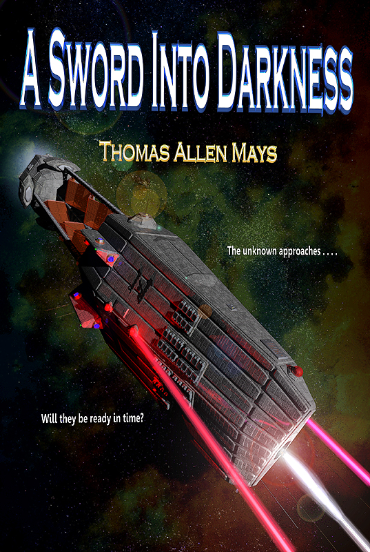
Cover 1, centered title. This one is standard, but the title might be more difficult to read in a thumbnail on Amazon.
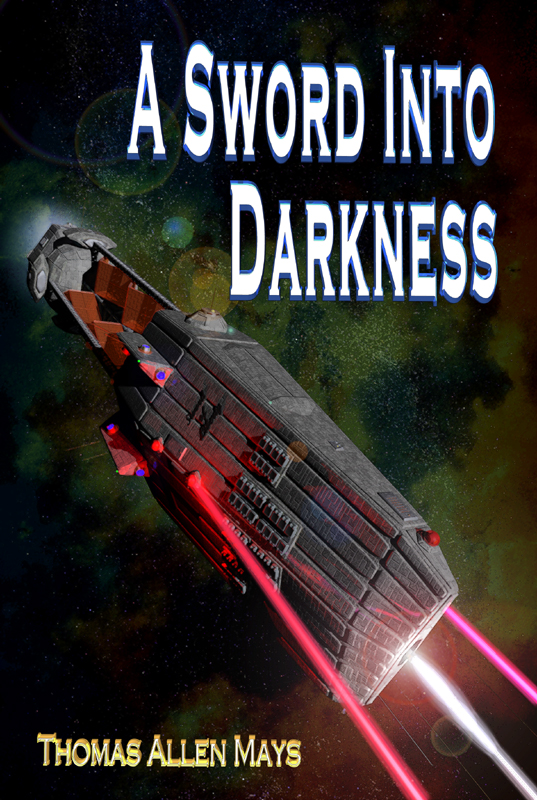
Cover 2, the “Z” layout. This one makes more effective use of open space and pushes the Sword of Liberty further back. Oh, and if you noted it’s not as bright as the other pic, that’s easily fixable. Specifically, which layout is best?

Cover 3, the “S” layout. This one uses the pic from the first post, but maximizes title size for thumbnails.
And that’s it. If none of these appeal, or one appeals particularly, or you think a particular tweak is needed, please leave a comment below. Otherwise, absolutely please vote in the following poll. Multiple visits and votes are allowed. May the best cover win!
